Enhancing the wayfinding experience to grow and retain a fanbase.
USA Rugby
USA Rugby is an organization responsible for creating and maintaining awareness around rugby in the United States. The organization was interested in learning new and current fan behavior on their website in order to discover how they could enhance their online experience.
Role: UX Researcher
Team Members: Jamie Chen, Prachi Chhajed, and Wenjing Wu
Background
USA Rugby discovered they had an issue with retaining their current fans and creating new ones. The organization was interested in redesigning their website to become a reputable site for news and updates on the national rugby teams.
I worked on a team of 4 people to discover current and new fan behavior by analyzing the USA Rugby website analytics. From our findings, we pitched several new designs on the website to A/B test.
Objective
We will learn fan behavior on the USA Rugby website to find out what he/she would like to learn about a team or player.
Understanding their behavior can help us determine what the website needs for fans to trust it as a reliable source.
Responsibilities
Over a 4-week period, I worked on a team of 4 where I identified notable differences in between new and returning visitors on the website's content categories related the national team and player information.
As a UX researcher, it was my responsibility uncover relevant findings to create an A/B testing strategy and deliver a report to the USA Rugby partners.
Researcher Tasks
Website Analytics
Iteration Design
Multivariate Testing
It's all about the fans!
What did they need?
USA Rugby is responsible for growing and maintaining rugby’s relevance in the United States. We believe there’s one important audience that can help the organization’s efforts - the fans.
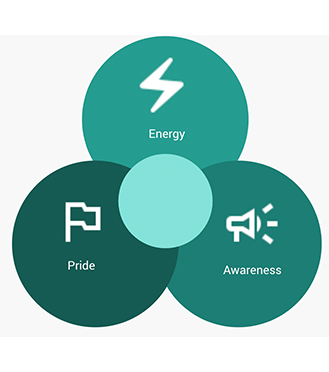
A fanbas bring energy, pride, and awareness to the team or sport they support. The larger the fanbase, the stronger the fanbase. The team and I focused our efforts on understanding just who the fan is and what they need to engage with the USA Rugby teams.
Fan Type & Engagement Requirments
I designed a workshop for the team that helped us first learn who a fan is and what do they need. We realized that there is a spectrum of the fan experience - some are dormant, some are die-hards. Each type had different needs and desires when engaging with a team. The more devoted the fan was, the more information and engagement tools they needed.

What could we find out about fan behavior on the USA Rugby website?
Are visitors successful at finding the most popular player information across the USA Rugby team pages?
Where do visitors exit as they engage on the player or team pages?
What activities do new and returning visitors do when they arrive on the USA Rugby player or team pages?
The website had a ton of new fan visitors, but they couldn't find what they wanted or needed.
They rarely found the most valuable pages.
I used Google Analytics to find out what new and returning fans were doing and what they were interested in. Returning visitors had a much easier time finding content like team rosters, schedules, results, and player profiles. However, new visitors had a much harder time finding these pages.

People Just Come And Go
Whenever any visitor found a USA Rugby team's homepage, they would leave without engaging or discovering more information about the team. The main homepages had high numbers of pageviews, but also high exit rates.

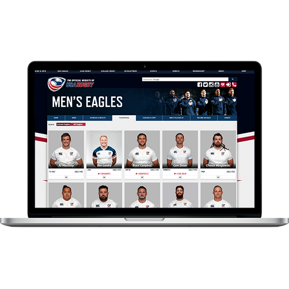
Those who did decide to stay and engage favored the Player Pool pages based on click heat-maps of the local navigation. The Player Pool page was a list of the team's current roster. Although this was a popular page to click into, the term 'Player Pool' may be confusing to new visitors.

Why are roster pages important?
They display a group of players who are identified as the best in their country.
Fans can quickly learn and connect with the players individually.
They give new fans a first glimpse of what the players look like and who they are.
Visitors paid most attention to the team roster and schedule pages.
This was an ideal opportunity for our team.
Google Analytics, alone, showed that the roster and schedule pages were areas where the most time was spent. If that was the case, then any opportunity we could come up with might show a major impact. So, I focused on how to make it better.

Pageview Volume Varried Amongst New & Returning Visitors
Besides the homepage, team schedule and roster pages were the next most visited. New visitors were less likely visit a roster or schedule page than returning visitors. However, both page types were the most popular for both visitor types.

Although more pageview volume was dedicated to the schedule pages, visitors spent way more time on the roster pages - espcially returning visitors. Thos visitors spent up to 54% more time on roster pages than new visitors. Both visitors bounced at lower rates on the roster pages as well - returning visitors bounced even less.

So, the roster pages had the most activity and all visitors showed that this page was somewhat valuable - but what were they doing on it? Is there anything we could do to make the experience better? Upon looking at the video captures from Hotjar, I saw visitors followed a common pattern.
They wanted to visit the player's profile pages but had a difficult time finding out where they could access it and a difficult time engaging with the small chevron arrow below the player's image. It was too small and there wasn't any messaging that let a visitor know what it would do.
The Main Takeaways
Visitors come and go - they rarely engage with information about the team beyon the homepage.
The team schedule and roster pages are most important to both new and returning visitors.
It's a bit difficult to click on small icons with a mouse and/or learn what they might do without any copy for context.
Optimize the local navigation & player cards for optimal wayfinding.
Small improvements - big impact.
Improving the copy choices on the local navigation that is understood by all visitors should bring more eyeballs to the players on the USA Rugby teams. Emphasizing directions and increasing the size of clickable elements on the player card might do the same. An easier way for new fans to learn about current players is an important strategy for increasing the fanbase.
New & Improved Local Navigation
Changing the local navigation copy from 'Player Pool' to 'Team Roster' creates a better understanding for all types of visitors - especially new ones. Now, it will be easier for those who aren't familiar with rugby terms to find one of the most valuable pages amongst visitors.

Increasing Access Points to Player Profiles
From the videos captured showing visitor behaviors on the roster pages, visitors had a difficult time knowing where to click, aiming their pointer, and performing repetitive actions. With the current state, it would take 2 clicks - one on the small chevron arrow - to land on a player profile page.
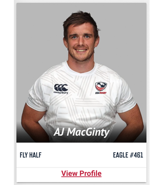
Instead, the profile image is clickable and the 'View Profile' tag replaces the chevron arrow at the bottom of the player card. The downside here is that the visitor loses the ability to quickly view short details about the player - they have to now commit to clicking a link and loading a new page.

Testing a new player card on the roster page.
A/B Testing with Google Optimize
Our team believed the best approach for immediate impact would be to A/B test the new player card design. We believe the new design would decrease bounce rates on the roster pages and increase overall pageviews on any player profile pages.
The client was extremely receptive of this test idea and we are currently working with them to impliment Google Optimize website tags before launching the test.
