Renovating the music rental process.
Overview
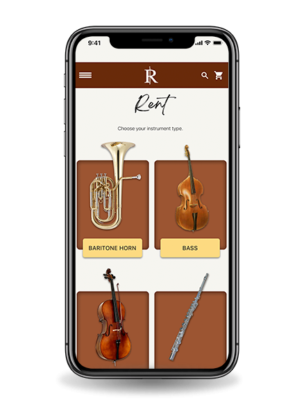
Rental Instruments is a family-owned business providing a novice and experienced musicians access to instruments. The company required a mobile site redesign to make it’s online storefront mobile-friendly and competitive with other music rental websites.
Role: UX Researcher
User Research, Mobile Layout, Project Management, Usability Testing
Background
RentalInstrument.com has been providing students with top quality band and orchestra instruments for rent since 2004. The company began with offices in Greenwich and Westport, Connecticut.
It has since expanded with an office in New York City and safe, quick, and reliable shipment of rental instruments around the United States through its secure online ordering system.
Problem
Rental Instruments LLC was falling behind when it came to maintaining their digital storefront. The mobile website was extremely neglected through the misuse of fixed-width layouts, a disorganized taxonomy, and design systems that were not standing up to modern systems.
Originally, our task was to come up with a general redesign of the mobile website. However, our usability tests and competitive analysis showed the website was not up to modern standards. This helped us find out what exactly we needed to do within the design.
Team
On this project, I was able to work with a creative director and visual designer on a 3-month design sprint. I supported the user research and project management throughout the life cycle. However, we all helped out at every stage in the process.
Some of my key achievements were...established a design process, implemented a design system, shared proper research influencing the design, documented the entire taxonomy of the website.
My Responsibilities
Interview Questions
Project Management
Layout Production
Process Methodology.
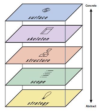
Waterfall and Garret's Planes
Our team landed on performing this redesign process by using Garret’s UX Model in a waterfall workflow. Once we completed each plane, we would move on to the next step. In understanding our solutions within each phase, we conducted user research, usability tests, and competitive analysis to uncover our design.
Due to the strict deadlines of the project, we had to use a waterfall methodology in order to complete the product on time. Before moving on to another stage in the project, we would present our findings on a weekly basis to the stakeholders. Our practice of waterfall ensured we could deliver on time and within the budget.
Strategy
In order to find out what we needed to do for this redesign, we needed to conduct a method on how to choose what to do and what not to do. Therefore, we wanted to ensure this deliverable was produced through heavy research by our team. We needed to find out who the primary persona was, who were our competitors, and what we needed to do to the structure and visuals to ensure it met our user’s needs.
User Research
Competitive Research and Testing
Design Implementation
User Research
Who are they? What do they need?
Our first activity to conduct research was to speak to them directly. In order to find a behavioral archetype, we needed to find a range of users who had little or plenty of experience with musical instruments.
Once we knew who the user was, we then needed to know what they expected out of an instrument rental site. How did they group information? Were they educated on instrument classes no matter their experience level? What did they want to know before they booked a rental on the website? We used a list of exercises in order to find out answers.
Character vector created by vectorjuice - www.freepik.com

Types Of Studies
Screeners
To make sure we are finding the correct users to interview, I designed a screener meant to filter out people who wouldn't fit our desired user. Since the mobile site we were redesigning was for instrument rentals, we required certain experience levels in order to qualify that user for an interview.
User Interviews
Our interviews consisted of a notetaker, an interviewer, and the interviewee. This way, the conversation could keep going at a regular pace without any interruption. We felt semi-structured interviews were the best method as it would allow each of us to dive deeper into a user's answer if we felt it would lead to something important.
Card Sorting
This exercise for our users was meant to realize what organization methods were needed or not. We would implement this on specific users whom we believed fit our persona based on the user interviews. We used a closed-sort in order to understand and discover the users reviews of the current website taxonomy. Then multivariate test on experiment group using a new organization to the site content to see what worked
Fascinating Findings
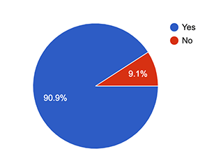
Do you own an instrument?
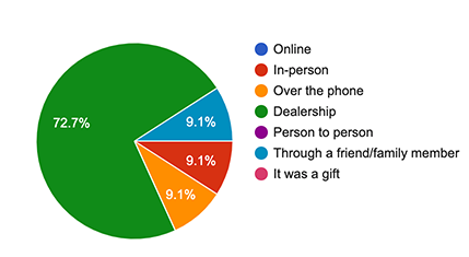
How did you purchase the instrument?
Quotes from Users
"I rented an instrument because I wanted my child to take part in music at school."
"I played an instrument years ago when I was in high school. Now, I want my son to have the same experience."
"Before I choose an instrument, I want to try it out first before I make a move on it."
Behavior Mapping
Story Maps
To make sure we are finding the correct users to interview, I designed a screener meant to filter out people who wouldn't fit our desired user. Since the mobile site we were redesigning was for instrument rentals, we required certain experience levels in order to qualify that user for an interview.
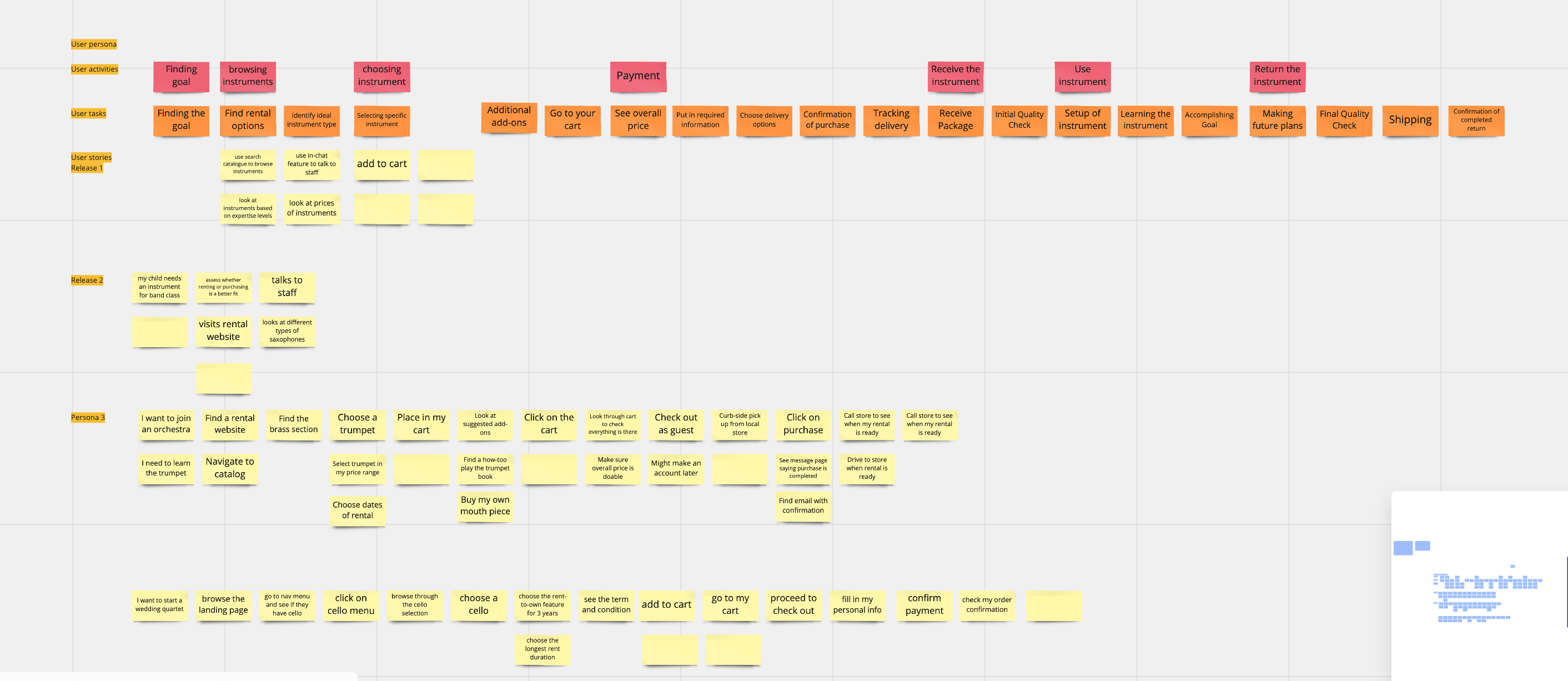
After interviewing our users and ideating on the journey the would take to rent an instrument, we finally had enough data to agree on our primary persona. This would be our user we would be primarily designing for. Although we were able to figure out secondary and shared personas, our deadline wasn't able to consider these in the interface design. Knowing this, I would try to find faster ways to design for our secondary and shared personas - possibly by finding a common denominator of the three persona types.
Primary Persona
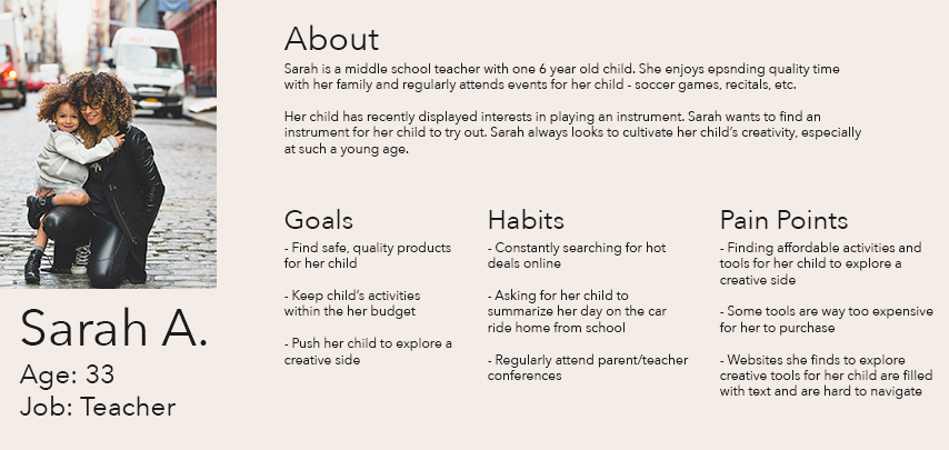
Important Characteristics
Constantly looking for avenues for their child to practice and pursue creativity.
Willing to find another company to shop with if it doesn't provide suffiecient or digestable content.
Invests in their child and regularly attends their events.
Card Sorting
Our preferred method towards accomplishing our desire to know the user’s mental model was using an open card-sorting workshop. In this activity, our subjects saw a list of content cards we identified that remain on the current website. 30 cards were given to each subject in order to group them as he or she choses. This open method helped us identify the mental model of our primary and secondary users. With it, we were able to construct the website information architecture with help from the grouping patterns we have uncovered in this exercise.
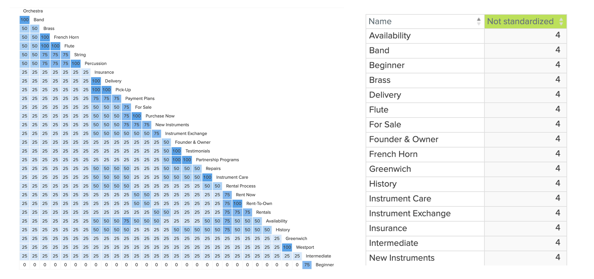
This exercise would help us identify the next step in the phase - structure - which we would then look towards using a card sorting study with our primary personas.
Results
Instrument Types
Our test subjects were not familiar with how instruments were catagorized or what types of instruments fell under each categorization. The terms like brass, woodwind, and percussion were not known or familiar by the sujects.
Naming Conventions
Some of our cars, like availability, and partnership programs, were not presented correctly in the study. This helped us reformat the excersise for other participants.
Familiar Website Navigation
With the content we asked our participants to organize, each person had a similar pattern to how they organized the content. Each one grouped content like location, history, and staff, under the about us group.
Mental Model
After conducting user interviews, ideation sessions with our team, and card sorting excersies with our participants, we landed on a mental model we thought captured the questions and actions our primary user would have. This helped us shape our understanding as to how our primary user interacts with a mobile site used for purchasing product and what information about rental instruments they would need before the purchase.
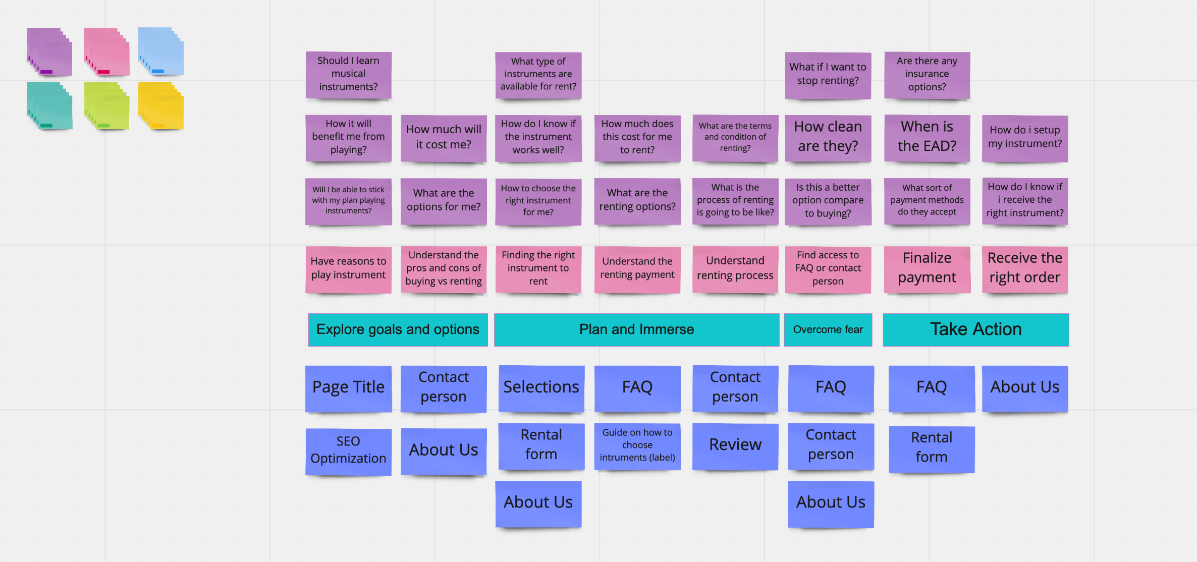
Based off of our user interviews, we generated a mental model of our primary persona. We designed out mental model map through sharing questions we heard in each user interview. After listing out the questions, we categorized them based off of where we saw these questions would be asked in the rental process.
The Site Map
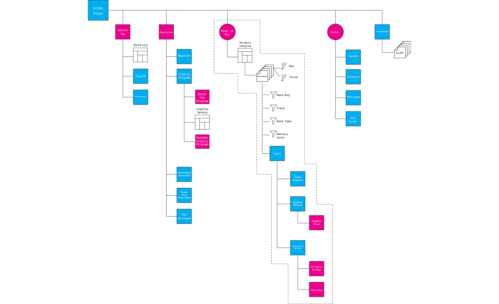
From our card sorting studies and mental model creation, we were then able to synthesize this research into a site-map. This structure was necessary to move us into the next plane of Garett’s model - structure. With this site map, we were able to visualize on an abstract level what was necessary and what content would be grouped together based off of our card sorting research.
The site map is a beautiful visual into how the structure would seem. Although it may just look like a bunch of lines and squares, this increased our excitement as we knew we were just starting the actual build of the new website.
Competitive Research & Testing
What were we up against? How will our experiment go?
These are two imporatant questions that would provide valuable answers on just how our products will succeed.
We needed to know what were the competitors and what they were doing. Our next step would be then produce low and medium-fidelity prototypes to conduct usabilit tests.
Competitive Analysis
In order to build a system to support novice and semi-experienced musicians, we want to find out how these users have been supported and not supported through other online rental websites.
A competitive review was conducted to assess the strengths and weaknesses of our competitors and have a basic understanding of where Rental Instrument, LLC falls within the market.
Our Criteria Included...
Instrument catalog organization • Mechanisms for sharing product looks • Price placement • Sales person contact • Showing the user journey • Flexible navigation of site • Caretaking content strategies

From our competitive analysis, we found out what works, what doesn’t work, and, most importantly, what we learned.
What worked was the personalization starting from event-driven goals, at home try-outs of products to ensure fit for users, selections of pictures showing customers using a product and achieving end/life goals, and use of second person pronouns.
What did not work was the account sign up necessary to move through product selection and research, lack of filtering on catalog pages, and lack of customization.
We learned that our website needs to create affordances letting the user browse flexibly, get rid of unnecessary account registration, let the user identify his or her situation, and extend the personalization outside of the digital experience with a product to “test-drive”.
After finalizing out analysis of direct and indirect competitors, we were finally able to move on to the design fifelity phases.
Paper Prototypes
When moving into the skeleton of the new website, we wanted to start with an approach that would let the mind run wild with ideas based on the previous research we conducted. Our group put pen to paper to conduct our fist phase pf prototyping - the low fidelity.
Purely just black ink on legal, we split up the designs into 5 tasks that we believed were essential to the website - rentals, account signup/login, membership selection, trade-in, and returns.
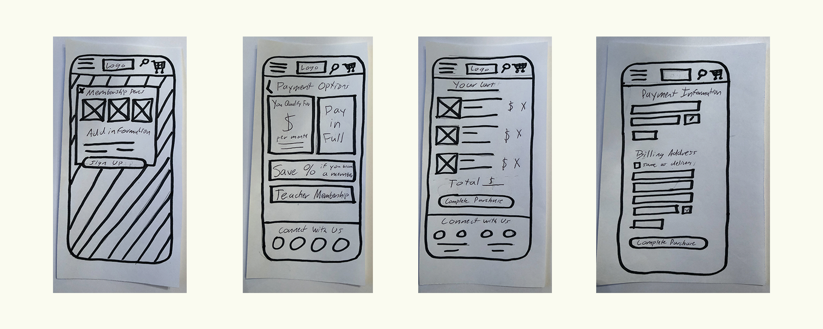
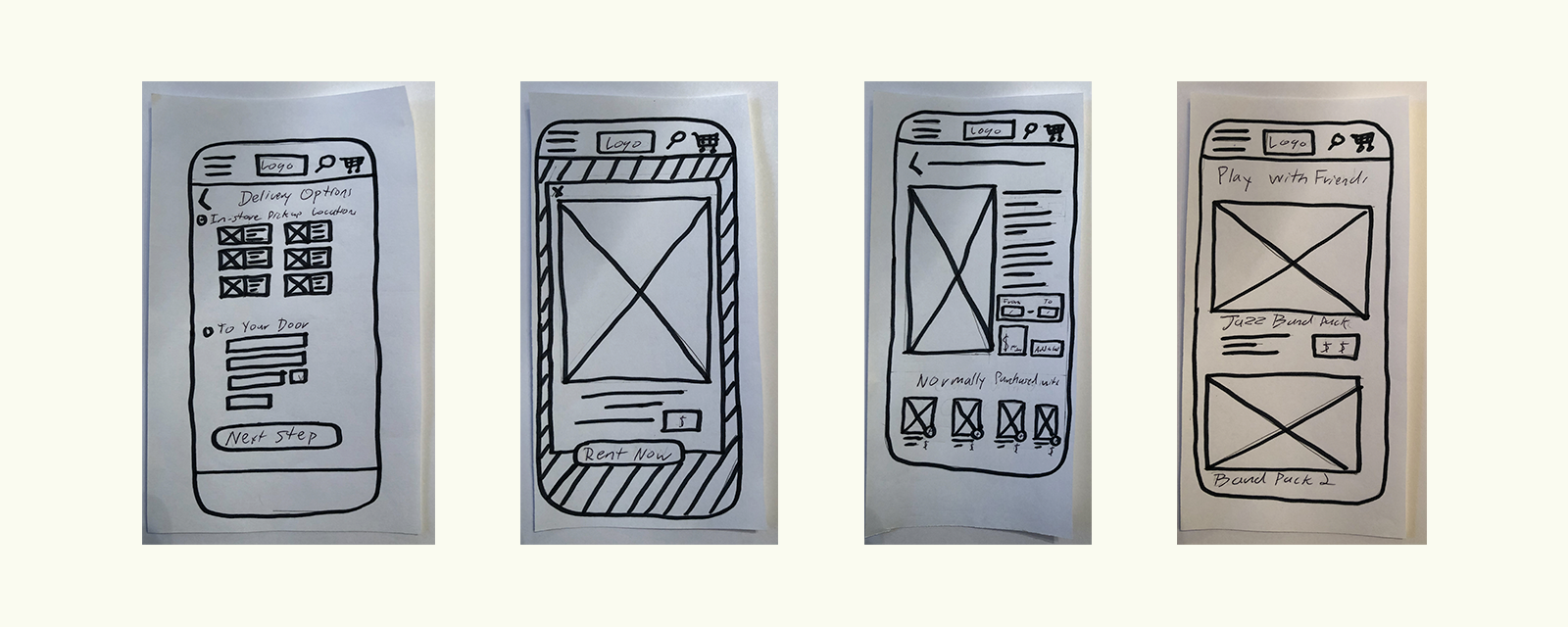
In this activity, our paper prototypes needed to be strong enough to conduct a usability test we would run before moving on to the next phase in fidelity. We saw through paper prototyping we could provide a large enough quantity of mobile layouts that eventually we would find a quality product.
Once we pulled out screens together that we thought were appropriate based on our user research & competitive analysis, we moved on into the next step within the skeleton phase - medium fidelity.
Low-Fidelity Usability Test Findings
"The rent button should be one of the first things I see."
"I'd like to see the amount I am spending through the checkout process."
"Including PayPal and Venmo is important to me."
The usability test was conducted through a task-oriented approach. Each user was asked to complete a rental purchase. In order to understand more about the user, we asked each participant to take us through how they personally would conduct a rental purchase.
Their journey was unique and each looked at certain aspects and content of the site that helped them make an informed decision on giving this organization their business.
Medium Fidelity Wireframes
Although this was still boxes and lorem ipsum text, we were starting to see just how our product would live in its proposed environment - on a mobile phone. This was another point where we were synthesizing our research. We provided a loyalty program sign up based on experience of the user - this would provide a customized experience for those who sign up at different levels. We took out any unnecessary account sign up tasks that would impede our user from browsing. Most of all, we made sure our mobile site acted as a familiar e-commerce website our users would be used to.
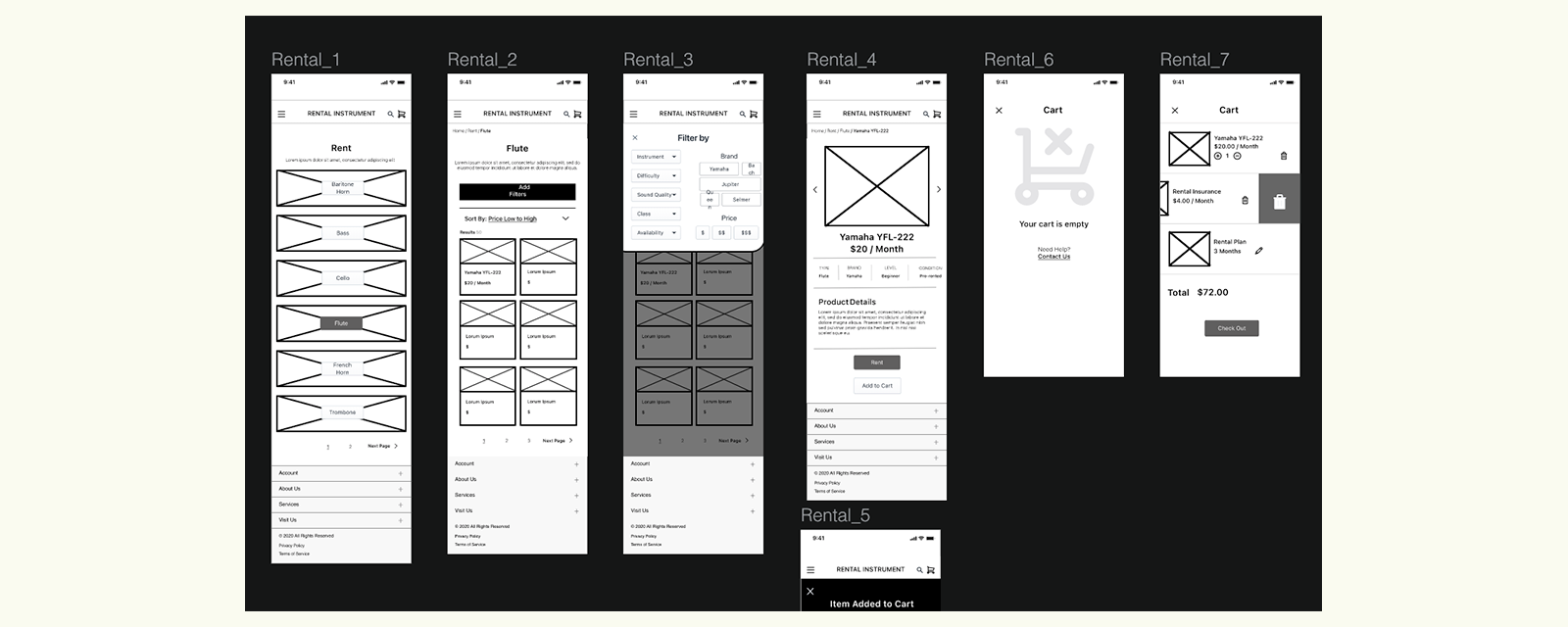
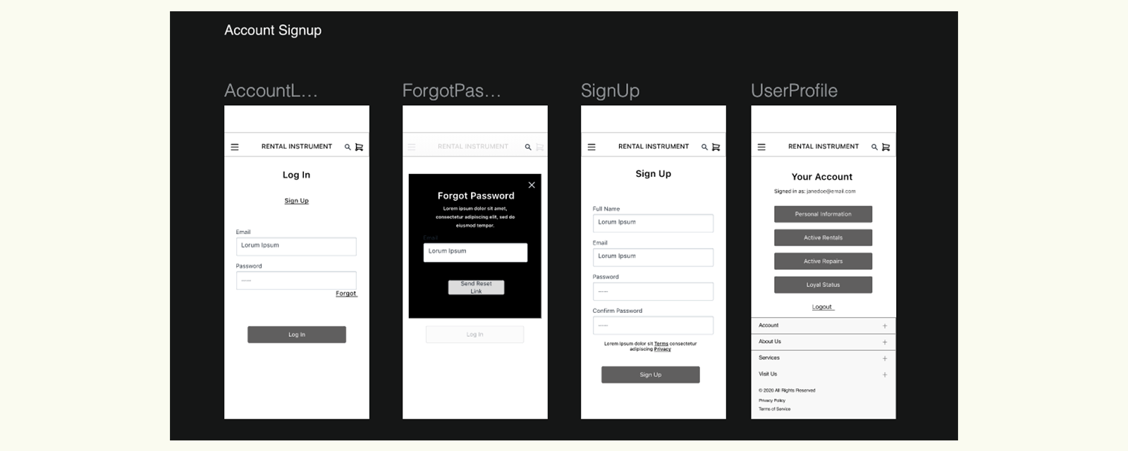
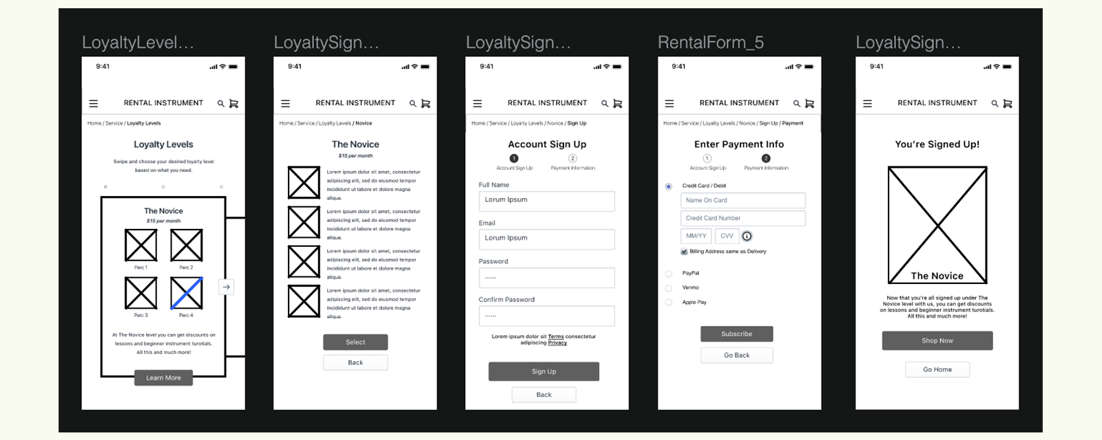
After organizing our content on the necessary screens, we pulled our medium-fidelity design into InVision for proper prototyping. This method would also help us test real users and ensure our idea was sound or consider other problems within the design.
Medium-Fidelity Usability Test Findings
"The website functions exactly how I would expect it to."
"When I sign up for a membership, does that also count as making an account?"
"Is there a difference in shipping costs when I choose in-store or at-home delivery?"
Usability Objective and Method
In order to understand how users would engage with our interface and cater to their needs, it is important to conduct usability studies. Usability findings determined by actions and sentiments of real users is crucial in assessing the effectiveness of the design of our mobile prototype of RentalInstrument.com.
To test the usability of the mobile medium fidelity prototype of RentalInstrument.com, moderated and unmoderated remote user tests were conducted through UserZoom Go and Usertesting.com. Participants were asked to complete ten tasks using the medium fidelity prototype as presented on Invision (Add Invision Link to Prototype here). Participants were also encouraged to think out loud while completing the tasks in order to express any other satisfactions and frustrations they may have encountered during the usability test.
After completing the usability tests, data was collected and analyzed by 3 usability experts from Pratt Institute. The usability tests resulted in 12 usability problems within the prototype. These problems were compiled and ranked based on the level of success when participants were completing tasks. Tasks that were partially successful but encountered with some difficulty / confusion were considered to be minor usability issues by the usability experts. Similarly, tasks that failed in completion or that were met with a lot of difficulty / confusion were considered to be major usability issues by the usability experts. (See Usability Spreadsheet)
The aforementioned major and minor usability Issues along with their solutions are described in further detail throughout the remainder of this report.
Usability Spreadsheet

Usability Reflection
As we conducted our usability study, we asked each user to complete a list of tasks the new website design would afford. Each user was able to walk-through to the completion of each task, however, there were still major and minor usability issues we needed to discuss. Most were based around the UX writing but the 2 tasks we had issues with were in flexible navigation and finding contact information on the website.
In the renting task, our users wanted to go back through the process if they realized a mistake was made. They also expressed the desire to see their progress in completing the rental forms. Each one was confused about the class of instruments, which was the first page you would start on with choosing an instrument to rent. This finding pushed us to completely delete this screen and use strong visuals in the higher fidelity product to show instrument types.
Users also wanted to find contact information - whether it was to an individual store or to the overall organization. Although the contact screens were developed, there wasn't a direct way for a user to find out this information without diving deep into the taxonomy. We would then take this contact link and place it in the navigation menu and our site footer.
Design Implementation
What were we up against? How will our experiment go?
These are two imporatant questions that would provide valuable answers on just how our products will succeed.
We needed to know what were the competitors and what they were doing. Our next step would be then produce low and medium-fidelity prototypes to conduct usabilit tests.
Creating A Design System
Our chosen design system was influenced by the soft, muted colors of instruments and the inviting feel our user needed based off of our user research. Each of us within our group decided to figure out our own design system to pitch. This was the most difficult part as bias comes in. Each group member wanted their own design system implemented or "frankenstein-ed" with the chosen design system. This was extremely troublesome since design systems live on their own and not in conjunction with others. Otherwise, each system would contain elements that clearly did not look like they belonged. Our team got over this point by choosing the system that was set up with components, organized, and made logical sense based off of our competitive analysis and primary persona.
High-Fidelity Solution
With our scope agreed upon and design system chosen, it was time to create the final edition of our product. We applied our design system to the medium fidelity wireframes to deliver our final solution.
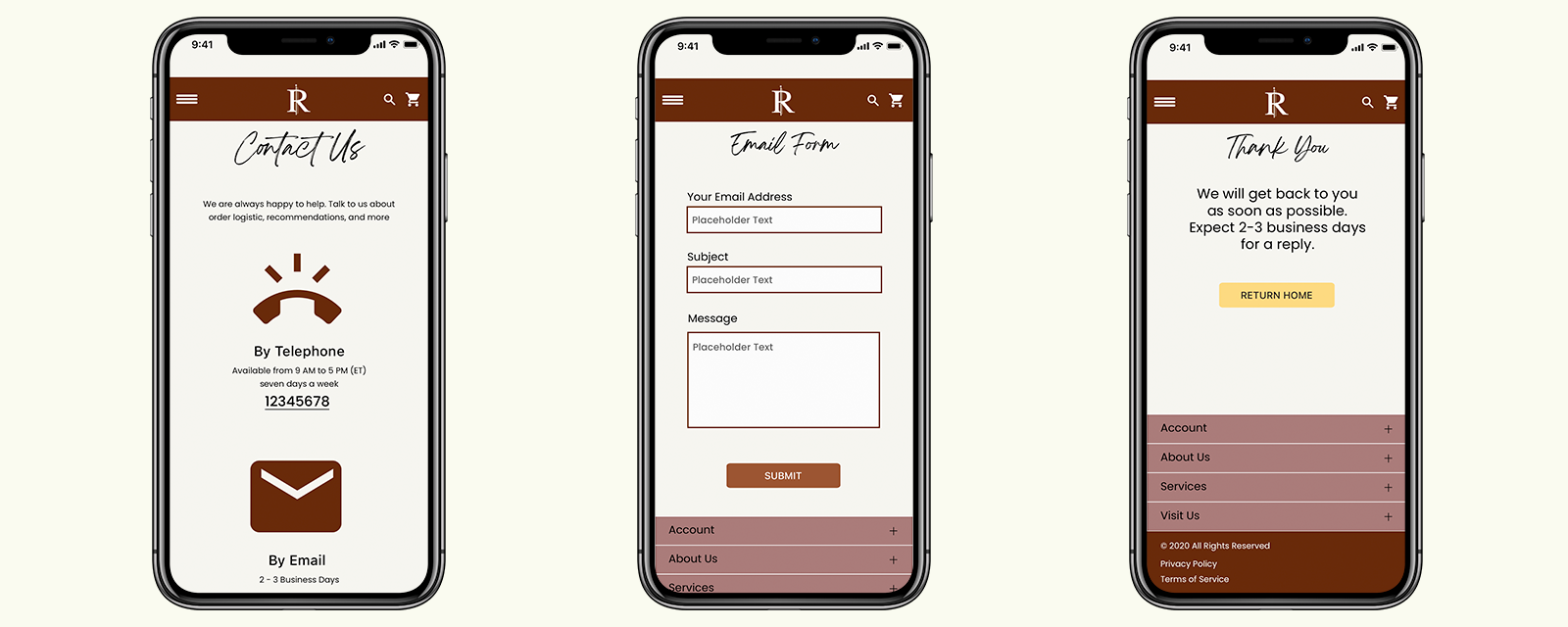
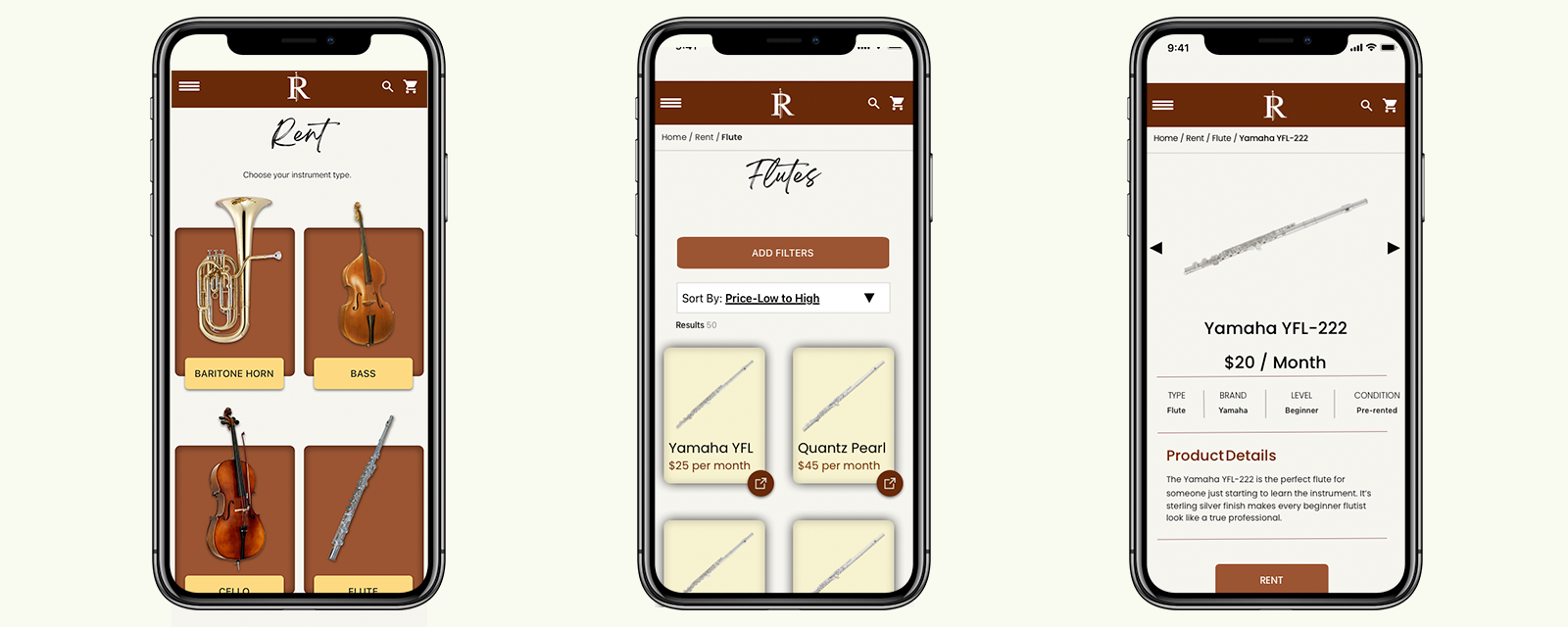
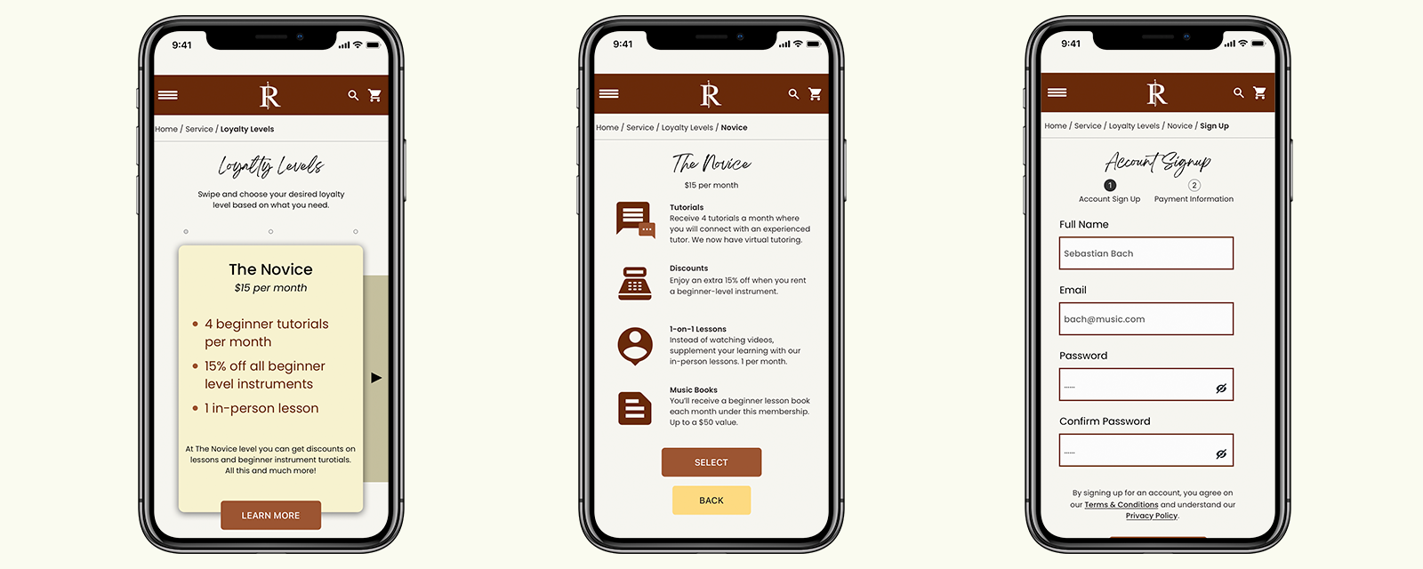
Our Solution
Based off of all of our research, we came up with a solution that looked professional, trustworthy, and provided an informative experience to users who were looking for instruments to rent regardless of their skill or experience level in music. Since our primary persona was mothers, our experience needed to be trust worthy and transparent - parents need more information to decide how to educate their children.
Our final delivery was through a prototype that was able to be interacted with. This gave the stakeholders and users an expectation of just how the mobile site would function after our work on the project. On presenting it to the team, it had a mix of satisfactory reactions. Although the mobile website was able to perform how it was needed, the design wasn't quite above the bar when comparing it to competitors with more interactive, dynamic micro-interactions. Knowing this, our next step needs to take an agile framework through the surface phase until we reach a more agreeable solution. Our team will conduct another competitive analysis, learn the latest trends for mobile sites, and undergo a heuristic study to discuss the product in more detail.
Personally, I would like to go back and conduct more research on color, find out what other users within our persona are doing to learn more about renting instruments and follow them on their journey as they choose an instrument to rent for their child. With the design system, I would like to experiment with different color schemes that would make the instruments in "pop" more on the surface instead of blending in with the backgrounds and other colors we have chosen. I would also test out the readability of our typographic choices. As much as we believe it fits the vibe of our vision, I think there are better choices out there for type as headers.
Conclusion
On a team, I was able to work with our team, organize calendars, and ensure we met expectations from our client on what we needed to deliver. I took a product through the lifecycle to completion - I know now more of what it takes to complete such a project through research, design, and collaboration. Is this product finished? No. Iteration will prevail as a way to ensure our product and Rental Instruments remains a competitive music rental website.