Determining how snackable snippets can create a more user-friendly experience.
Cooper Hewitt
Cooper Hewitt is a museum in New York devoted to archiving and showcasing contemporary design artifacts. The communications and marketing team were interested in discovering how young students interested in design could find events and related articles.
Role: UX Researcher
Team Members: Jamie Chen, Prachi Chhajed, and Wenjing Wu

Background
Cooper Hewitt recently created two new webpages used to house multiple types of content relating to a particular subject. Those two pages were called ‘Emerging Designers’ and ‘Design Topics’. They were interested in how people scanned them and found them using the website’s navigation.
Over a 4-week period, I worked on a team to uncover people’s viewing patterns on the site and their ability to find specific information related to those webpages. We suggested two new ideas for the museum to optimize the webpage for easy viewing.
Objective
Our goal was to learn what people used to make decisions on where to go and what to chose while performing several sets of tasks we believed normal website visitors would perform.
Discovering what these important elements were would help us determine optimal design strategies for making their tasks easier and faster to complete.
Responsibilities
I was a UX Researcher on the team responsible for test setup, moderation, observation, recruitment, and synthesis. The team gave me the responsibility of focusing on the scanning patterns to help understand what issues our users were facing when asked to perform a particular task.
I was also involved with handing off the insights to the client through a team presentation.
Researcher Tasks
Testing Strategy
Moderation
Design Iteration
That's it, I'm calling customer support.
Assistance wouldn't be needed on a second go-around.
Cooper Hewitt’s website taxonomy was a bit confusing for most, if not all, participants. However, once they were told where to find specific pieces of information, they soon realized the rationale of its placement.
This led people to believe that the website was not usable since they couldn't complete the tasks on their own.

Performance Metrics On Tasks
Overall, participants were split on completing the tasks during their usability test. Two of the tasks asked participants to find an event starting from the homepage. None of them could successfully find those items on their own and most would blame the taxonomy for not following their own language.

Once they were shown how to find the events, they found it easy to learn how to get there.
"Once I was in the right place, it was clear to me how to get there."
"I think I could find it on my own the next time around."
"I see why they placed it there but I would nevet get to it on my own."
People struggled finding anything on their own.
The design of the page also led to a difficult scanning experience.
I asked participants to find the workshops and career fairs that Cooper Hewitt hosted and managed for young students interested in design careers. Their first move was to ther Events webpage where their scanning habits were inhibited by how long each item was.

First Intentions
When a participant was asked to find a workshop or career fair for young students interested in design, they never clicked the ‘Emerging Designers’ page. That’s where all of this information would be found. Instead, they clicked on the Events section of the website.

When they landed on the Events webpage, each event result took up the entire width of the screen. This led to they eye jumping randomly across the screen. A design like this would possibly increase the time on the task and lead to participants deciding the site isn’t as usable as they’d like.
.gif)
How were the participants reacting to the page?
"There's so much going on here, I don't even know where to begin."
"I spent a lot of time on this page only to realize the fair I'm looking for isn't even here."
"It looks like they only have one event. Oh, you can scroll down and see more."
Thumbnails that are too wide or too tall are not optimal for scanning habits.
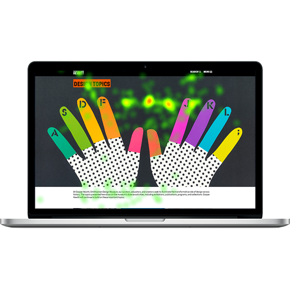
The heatmaps showed that the screen real estate could be utilized better.
As the participants tried finding the right information to complete the task, there were forced to read through long textual descriptions. Sometimes, if the header was too vague, they would have to read every word in the thumbnail.

People Focused on the Headers First
The heatmaps were showing a clear story of how the participants would use headers - that was the first element in the thumbnail used to decide if they were going in the right direction. If the header was too vague, they’d have to read the entire short description. These were regularly long and contributed to usability issues and increasing time on task.

The gazeplots on the particular pages also share a very similar story of what kinds of information people are drawn to when making a decision. On the particular events pages, users focused in on the details about time, location, and the tags that show the themes of the event.

The Main Takeaways
Participants see the career fair and workshops as event related items.
People look for particulare keywords, especially in the thumbnail's header, to decide if they're on the right path.
Vague terms in a website's taxonomy can lead to low task completion rates and usability scores.
A clear taxonomy and shortened thumbnail design will create an optimal navigation experience.
Focus on what is most important in a user's decision making.
Our participants showed that they use large headings and clear terminology that they know to land on the event or blog post related to their needs. If the content is missing from the section they believe it would exist, they might never find it on their own. So, let’s meet their needs by placing the content in the areas they would first go to and slim down the content they see in a thumbnail.

Putting Events In Their Place
I created a new events page that followed best practices of thumbnail designs based on what users needed to see in their decision making, and added them to the Events page. Since this is the first place people checked to find an event, this should increase their task success and decrease their task time.

Make Blog Post Thumbnails Easier To Scan
The Design Topics page that showed blog libraries as thumbnails were long and hard to decipher. They also weren’t optimal for the scanning that our participants were showing - they never would read the entire description. Instead, they would try and find the keywords to validate they’re going in the right direction.
In this new design, we decided to go with a simplified thumbnail that would articulate keywords related to the blog libraries and shortened their descriptions.

Best Practice Findings
Create snackable design elements for faster, easier navigation experience.
Ensure that the website's taxonomy language fits the user's natural understandings and groupings.
Optimize the scannability of the website to fit the user's behavior.
Client handoff was a little bumpy.
Learning more on how to ensure the client's needs are met.
We presented our findings and recommendations to the client where the feedback wasn't what we expected. Since the current career fair on the website was from the past, they weren't sure our findings about the event pages were correct.
In the future, I need to do a better job at understanding the client's true needs and basing the participant tasks around them.
